Accessibility
Primer color tokens are designed to be accessible by default. This guide provides more context around how to ensure new patterns meet GitHub's standards.
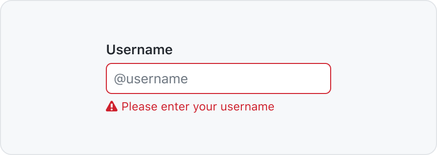
Color contrast between text and its background must meet required WCAG standards.
The contrast requirements are:
- 4.5:1 for normal text
- 3:1 for large text (>24px)
- 3:1 for UI elements and graphics
- No contrast requirement for decorative and disabled elements
Use an online contrast checker or a Figma plugin to test your contrast.
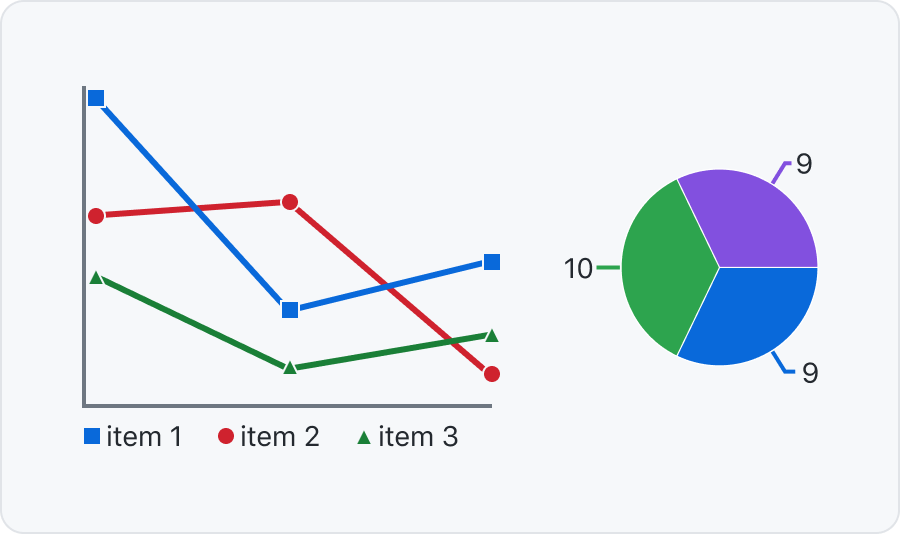
Show state with more than color
Color vision deficiency is different for different people. To make sure everyone can understand and use your UI you should show state with more than a change in color. Unless color is only used as a visual "flourish", the information that the color conveys must be present either in the text (e.g. in the case of buttons, the actual wording of the button label), or through some additional visual cue (such as an icon).
Connect labels to graphs with lines or patterns
For charts and graphs you can position the labels on top or close to each section. You can also use patterns to distinguish different parts.
Reference Color considerations for additional information about how color relates to compliance, and other focused documentation topics.